As most of you probably already know I am in the final stages of getting my current novel “Leave Yesterday Behind” ready to publish.
I am waiting on my talented beta readers input… so I will know ‘if’ and ‘where’ I need to make any final corrections. (Keeping my fingers crossed… hopefully it won’t be a long list of corrections to be made).
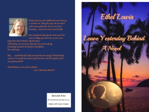
My next step is finding the BEST COVER and I NEED YOUR HELP!
Please vote on the cover YOU like the BEST!
#1 Top Cover
#2 Bottom Cover
I know they look almost identical, and probably either one would work, but I can’t decide. Please help – what do you think?
Thank you for your help, (and Happy New Year once again!)
Ethel


I think you should use the top one and I want to say I am very proud of you
LikeLike
I like #2 best. It has more character. Nice covers, btw.
LikeLiked by 1 person
Hello Kim,
Thanks for stopping by and voting on your favorite.
Your vote is much appreciated.
Ethel
LikeLike
Definitely number 1!
LikeLiked by 1 person
Thank you, Marie Lavender,
You vote is greatly appreciated.
Best wishes,
Ethel
LikeLike
#1 for sure!
LikeLike
Thank you, Elaine, for taking the time to stop by and posting your vote.
I do appreciate it very much.
Best wishes,
Ethel
LikeLike
Both are lovely, but I’ll go with option #1 (top)! The oval shape of the bottom one makes it look a bit more old-fashioned, in my eyes. 🙂
LikeLike
Thank you for stopping by and adding your vote, Nicholas.
I do appreciate it.
Best wishes,
Ethel
LikeLiked by 1 person
Hi Ethel, I like the top one 🙂
LikeLike
Thank you, Jade, for stopping by and voting.
Best wishes,
Ethel
LikeLiked by 1 person
number 1 🙂
LikeLike
Thanks, Sacha, for stopping by and adding your vote. Much appreciated.
Best wishes to you in your future endeavors,
Ethel
LikeLiked by 1 person
I like the #1 but something about #2 makes me choose that one.
LikeLike
Thank you so much, Junior. I appreciate you stopping by and lending your vote to help me decide.
Wishing you much success on your writing journey,
Ethel
LikeLike
Very welcome and thank you!
LikeLiked by 1 person
The first one gets my vote. 🙂 #1
LikeLiked by 1 person
Hi, Kev. Thanks for stopping by and lending your vote. It is much appreciated.
Happy writing and much success,
Ethel
LikeLiked by 1 person
My pleasure, Ethel. Thank you. 🙂
LikeLike
Hi Ethel. I prefer #1. They are both good, however, the second reminds me of a picture frame…my first instinct with a picture frame is to leave it alone and not touch it. The first has a more welcoming feel. Silas
LikeLiked by 1 person
Hi, Silas. Thanks for stopping by and casting your vote. And thank you, too, for taking the time to explain your thoughts as to why you chose the cover you did. Very helpful advice and much appreciated.
Best wishes,
Ethel
LikeLike
#1! Compared to that, #2 feels too enclosed. I’d rather see the big beautiful sunset flow off the edge of the page.
LikeLiked by 1 person
Hi, Jerry,
Thanks for stopping by and adding your vote. I do appreciate it very much.
Wishing you much success and happiness,
Ethel
LikeLike
I think number 2 is best, but, then, I’m partial to ovals 😁 Thanks for liking my site. I’m now following you in return. Adios! Don Sloan
LikeLiked by 1 person
Hey, Don,
Thanks for lending your vote, much appreciate it.
And thanks, too, for following.
Much success in your future and best wishes.
LikeLike
I like the first one better. The colors are more vivid. I also like the position and shape of the author silhouette better. It feels more right on the left side.
LikeLike
Hey, Susanne,
Thanks for stopping by and lending your vote. I appreciate it so much.
Best wishes and happy writing.
Ethel
LikeLike
Hi, Ethel — You visited a temporary blog where I’m displaying book covers for a “cover clinic” discussion at LinkedIn. You can visit that discussion here:
https://www.linkedin.com/grp/post/1515307-6030762343015739396
If you’re not already a LinkedIn member, you might find it helpful to sign up. It provides professional discussion groups for a variety of fields, including writing and publishing.
Best wishes for success with your books!
David Emil Henderson
LikeLike